As part of one of my final courses at Mount Royal University, I worked in a six-person team to collaborate directly with local businesses to strengthen their branding and marketing presence. Operating under the team name Bespoke Branding, I led several design and branding initiatives.
Our first client was Buyertise Inc. Early conversations revealed that the brand strongly identified with the word “fun.” When tasked with creating a new visual identity, my goal was to reflect this personality while maintaining clarity and cohesion. With a diverse audience of buyers, sellers, and brokers, I used the handshake as a central visual motif to symbolize connection and unity. In addition to this playful identity, I also developed a more refined and professional visual direction to demonstrate how Buyertise’s branding could scale and mature.
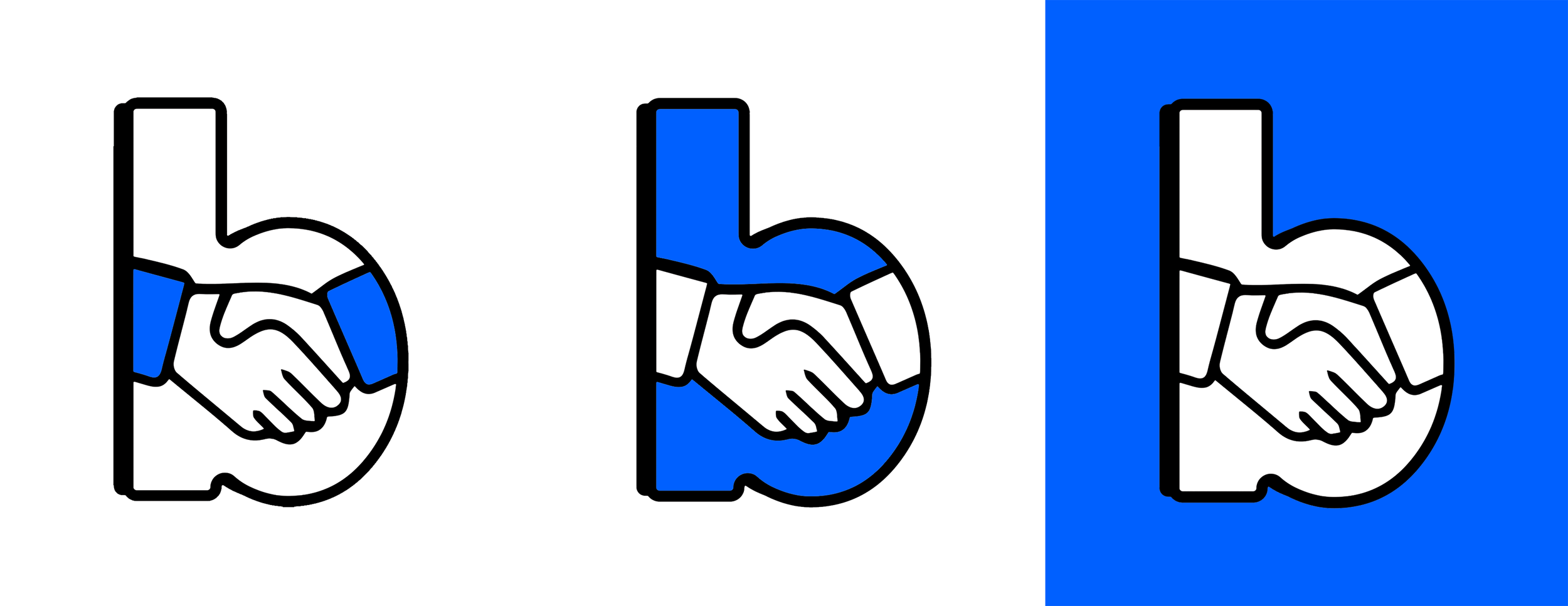

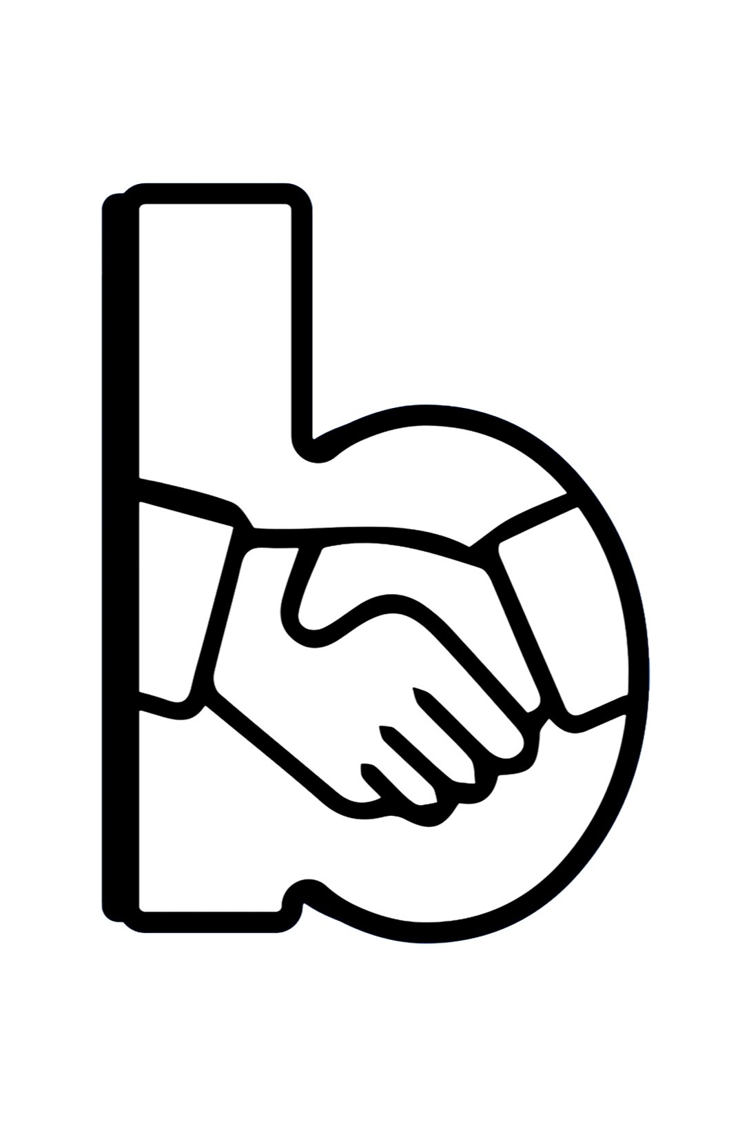

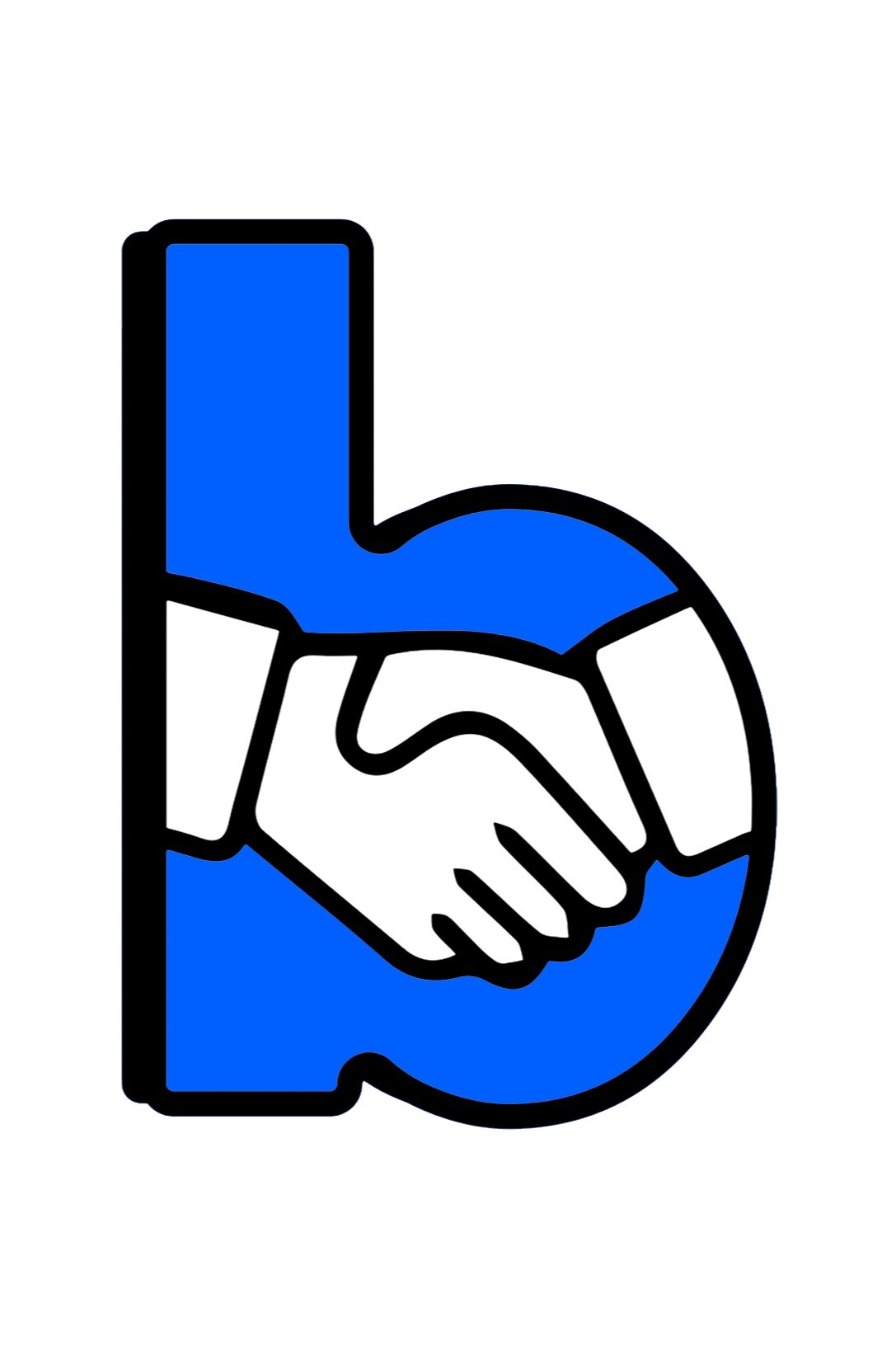
While I personally prefer a ‘fun’ look to Buyertise’s branding, I do recognize a simple, yet professional look is also essential. With this in mind, I muted the colours significantly, and changed the font in order to create a strong professional image to the brand, while balancing the look of an approachable, trustworthy company.